
An operations meeting opens with several reports showing different numbers. One team counts orders received, another counts paid orders, and the warehouse counts dispatched orders. Everyone calls their number today’s sales. The meeting is spent reconciling definitions before anyone discusses action.
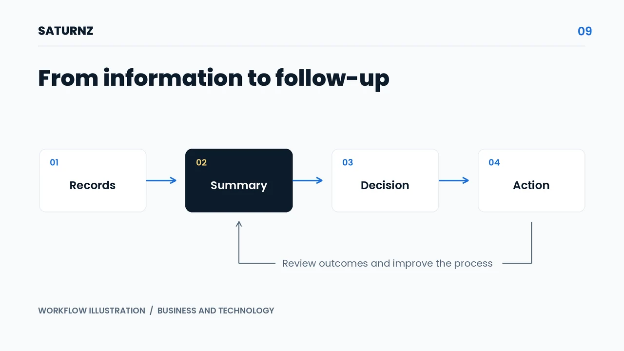
A dashboard helps when people agree on the decisions they want to make and the information required. A useful summary shortens the path from noticing a problem to assigning someone to address it.
Start with management questions
Write down recurring daily or weekly decisions. A manager may need to identify orders at risk of delay, purchases that have not arrived, or customer requests without an owner.
For each question, define a possible action. A list of stalled orders can help supervisors allocate work. Supplier delays can prompt purchasing follow-up. If a number would not change any action, consider whether it belongs on the main view.
Different users may need different summaries. A business owner might review weekly patterns, while service staff need a list of cases requiring attention now.
Agree on definitions before displaying numbers
Create a short description for each measure: what is counted, the source, the time period, and the responsible owner. Explain how cancellations or status changes affect the result.
For illustration, “orders due for dispatch today” counts eligible orders scheduled for today. It differs from all orders received today. A precise definition helps people understand why two reports might show different totals.
Show when the information was last updated. Managers need to know whether they are viewing current conditions or an earlier summary before giving instructions.
Provide a path from the summary to the cause
When stalled orders increase, users need access to the underlying list. Include the reason for the delay, waiting time, and responsible person. A summary without detail often sends people back to conversations for clarification.
Distinguish missing information from records that genuinely meet a condition. An empty field does not always mean there is no problem. Show incomplete records as items requiring review rather than hiding them inside a total.
Use colours and markers consistently. Keep written status labels so people can understand information without relying on colour alone.
Make the dashboard part of the working routine
Choose a review frequency that matches the decision. A fulfilment team may check its queue throughout the day, while procurement managers review supplier patterns on a different schedule.
Every finding that requires action should have an owner and a review time. Record the decision, then check whether the same problem returns. This makes the dashboard part of managing work.
Assess usefulness through the time needed to identify a cause, overdue work without an owner, and completed follow-up. The number of charts or page visits does not fully explain the operational benefit.
Organise information around the process
The Magnolia procurement case study provides context for connecting requests, purchasing, stock, and reporting. In the attendance integration project, monitoring needs follow the responsibilities of supervisors and administrators.
Saturnz can help define the questions, information sources, and follow-up process before building a dashboard. Bring the reports your team currently uses to a consultation about operational decisions. Together, we can identify the summaries that support useful action.